11 seconds is the average time your subscribers will spend looking at your emails according to Litmus Email Analytics. You could spend hours tailoring content to your readers and they are gone in less time than it takes to tie your shoe.
How are you supposed to grab your audience’s attention in a growing ecosystem of social media and targeted advertising versus shortened attention spans? User Experience (UX) design. It’s no longer about just compelling imagery, it’s also about building emails with your user in mind.
What is UX Design?
In short, UX Design means crafting emails that provide meaningful and relevant experiences to your subscribers.
Marketers have to wear a lot of hats. It comes as no surprise that you don’t want to wear another one. However, with a little empathy and a focus on navigation and design, you can build an email that will make the most of that precious 11-second window.
Here’s a few ways you can maximize your email’s impact in 11 seconds by simplifying your reader’s email experience with a focus on design and navigation.

Navigation
Navigation encompasses more than just directing and enticing your readers. It should act as the vehicle that takes your subscribers on your email ride. This starts before they even open your email and will steer your audience through your content and design.
Subject Line
The reader’s experience starts here. It’s the first thing they see. Do you know who you’re sending to? What would motivate that person to open your email? “Hey [Name] This Can Help You Grow Your Business” is an excellent subject line if that person owns a business. If not, straight to trash.
Clear Header
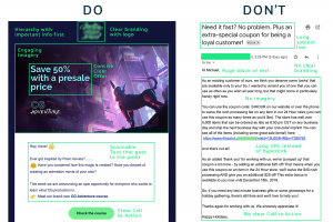
Once your reader opens your email, give them the information they are looking for. An obvious header establishes hierarchy and immediately directs the attention to exactly what you’re offering.
Important Information First
Leading with the information the reader wants establishes respect. You’ve drawn them in and have delivered the information they were hoping for in a way that’s respectful of their time. Get your point across in the shortest amount of time and convince them that any other information in the email is also valuable.
Call to Action
Further engage your reader by including a crystal clear call to action. Avoid being verbose or long-winded. “Download Now” or “Share on Twitter” are concise and effective, but just hyperlinking isn’t enough. Use larger text or a separate button to give your call to action the attention it deserves.
Design
Now that you’ve set up the framework for your email, here are a few tips to help you design an email that will maximize engagement.
Visual Identity
Your emails should reflect your brand to build trust. If a subscriber can’t immediately recognize who the email is from, they’ll just leave. Using the same colors and fonts from your website in your emails is a quick adjustment that will inspire confidence. The same goes for logos and your domain name. Be consistent.
Organized, Scannable Content
Opening an email to be greeted by a wall of unbroken 12-point text will definitely scare your readers away in less than 11 seconds. Establish a hierarchy by organizing your information with headers, color, and images. Doing so is not only aesthetically pleasing but also makes your content easy to digest for the reader in the average attention span.
Design Above the Fold
“Above the fold” comes from the upper half of the front page of a newspaper. For web purposes, you could say above the scroll. Give your reader the most important information without making them scroll for it. This goes hand in hand with placing important information first, but test on desktop and mobile to make sure nothing gets cut off.
Responsive Design is a Must
On average, 47% of people use a mobile device to check email, while 26.9% use desktop and 26.1% use webmail. – Vision6 “ Email Marketing Metrics Report (Dec 2017). Make sure to test your emails and optimize them to fit mobile devices. Skipping this step will ostracize almost half of your potential audience. Learn more about mobile design.
Avoid Excessive Imagery
Use imagery, but keep in mind too many graphics makes for confusing, unintuitive navigation and cheapens your content. Your email should be balanced. Let the graphics compliment your content, not overwhelm it.
Testing
Put your navigation and design to the test. Send someone your email and take notes, testing each stage of navigation. Where do their eyes go first when they open it? What information do they ingest immediately? If multiple users are encountering the same issues, you may need to revise your email. Don’t overlook a human approach to testing. Resources like Email On Acid to test emails can be great, but real-time feedback is just as useful.

The window of opportunity to hold your subscribers’ attention is getting smaller. But if you can utilize an audience-focused strategy that highlights navigation and design, you can make every second count.


