Design
Great design. Simple, colourful and enticing.

There’s some nice screenshots of the app itself, so you know what it looks like. Close-up detailed shots of your product or app work really well. If you’ve got some super crisp photography, use it!
The copy is broken up, which is good to see. If you have some lengthy copy you really need to put in your email, break it up into headings, sub-headings, shorter paragraphs, bold text, bullet-points, links, buttons, images, whatever you can, just make it more readable. Put yourself in your reader’s shoes, just because you care, why would they spend 5mins out of their busy day reading your email?
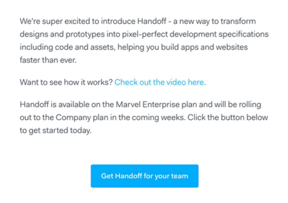
In this really short email, they mention Handoff 4 times! That’s best practice, keep hammering the message home.
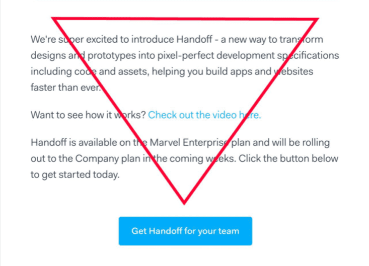
The CTA is a little low down the page for me, but it’s bold, colourful, and they’ve been a little creative with the copy, rather than simply going with ‘Click here’.
The footer – a simple centralised footer, which I especially love the ‘Made with ♥ in London’.

On brand
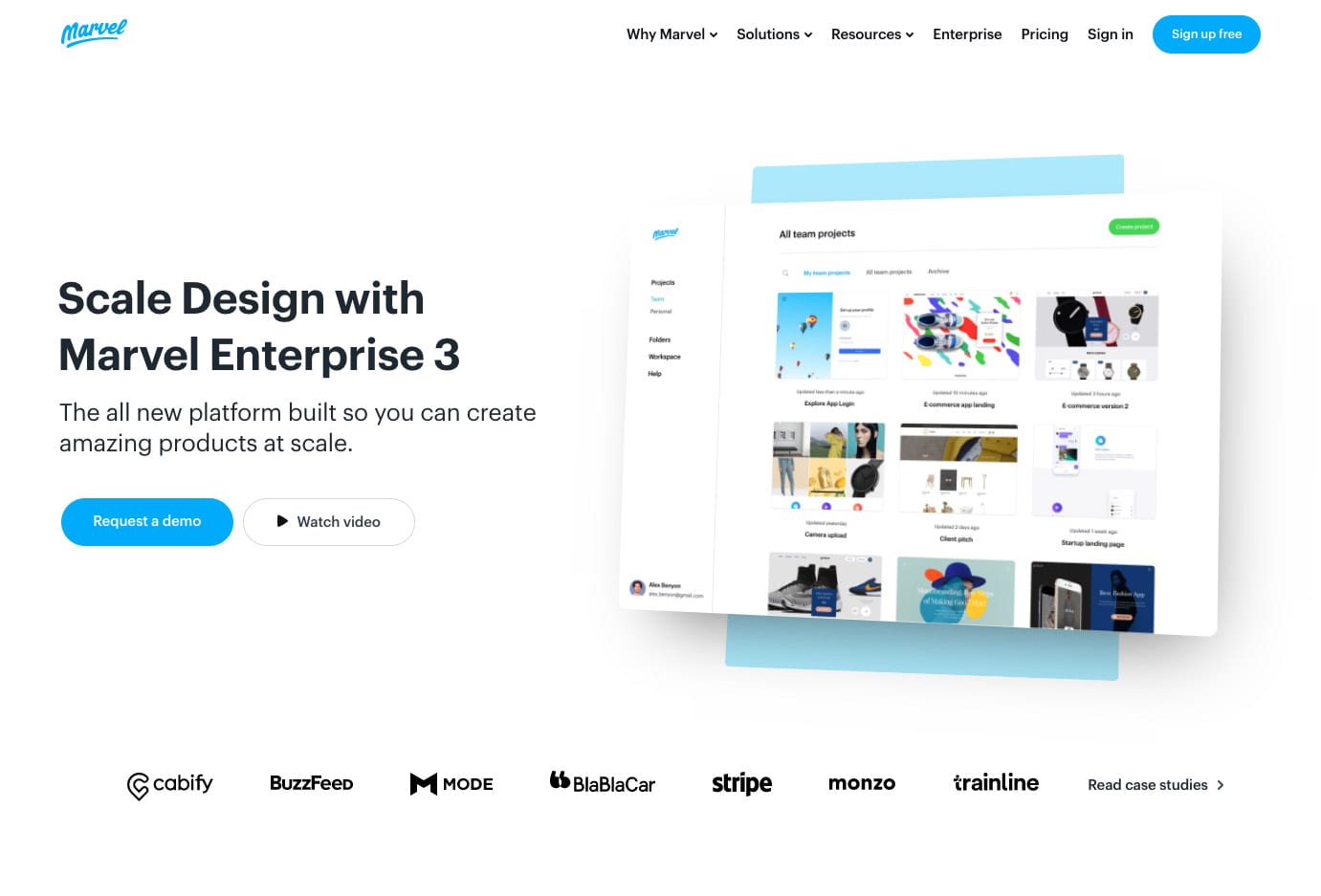
The Marvel App email is in keeping with their website, so the journey from email to web, making for a smooth customer journey.
Mobile view
Being a simple one-column email, it’s only logical that the email is scalable, squashing the content as the width reduces.
The mobile view looks great, as expected.

Layout
The email is laid out with lots of HTML tables and is made up mostly of HTML coded text, with the use of images within the main body of the email are kept to a minimum.
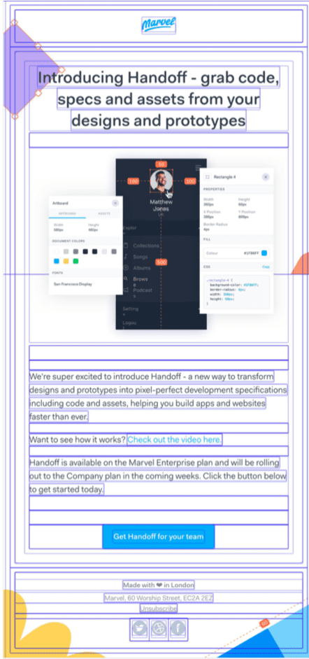
There is no ‘images turned off’ view for this email, as it’s the same as the images on preview. They’ve done this by adding all images to the email in the background. That’s not to say they are being sneaky, but they are applying the images to show in the background of a table, not within it.
Take this approach with caution, as some versions of Outlook and Android do not show background images. With Outlook and Android between them taking up 40% of the email client market share, you may wish to avoid this. Ref: https://emailclientmarketshare.com/
That said, check your own data, if you don’t have many people viewing your emails on Outlook, you may wish to tempt fate and try this approach.
Subject line
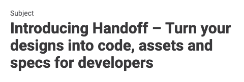
The subject line is a little wordy for me, I also find the fact they have reworded the headline and subject line a little confusing:
Subject line: Introducing Handoff – Turn your designs into code, assets and specs for developers
Headline: Introducing Handoff – grab code, specs and assets from your designs and prototypes
By doing so, they are asking you to make sense of both sentences, and work out what the new feature actually does. I would have suggested using the subject line to entice, and the headline to explain, as follows:
Subject line: Introducing Handoff
Headline: Turn your designs into code, with Handoff
Less is more.


