Design
I love the simplicity of this email. The blue colour throughout really works, they’ve designed the email around the brand colours, which enforces the brand identity.
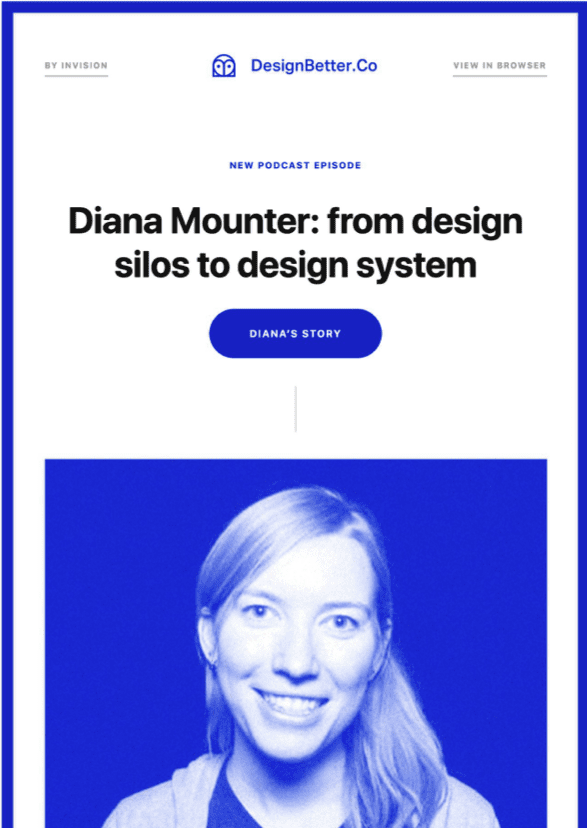
The email is promoting a podcast, someone’s personal story about how they use the product to get better results. If you can gather this type of content, then use it in your emails and social media, remember, people buy from people not companies. There’s so much distrust around in our post-truth world, that if you can share your brand message through the eyes of your customers, people will relate and trust the source more than if you were blowing your own trumpet.
Back to design…
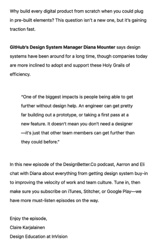
The copy is fairly lengthy, and to be honest I wouldn’t put so much in. Remember, email is a gateway to your website or landing page, so if your intention here is to drive people to listen to the podcast, don’t add much copy or info in there, just ask yourself when you set up an email: what am I asking the subscriber to do, if it’s click through, don’t ask them to read a bunch of copy. The saving grace is that they have a CTA at the top, so you don’t have to read the copy to get to the CTA…
Unlike the other examples, they’ve used a couple of links in the header, but notice the text is grey, not to overpower the logo and main content, there’s quite a bit of white space before the content begins, separating the header from the primary content.

The CTA – as indicated there isn’t much waffle to get through to get to the main CTA, good job! There’s also another CTA further down the page (with different text you’ll notice) in case you missed it the first time around.

On brand
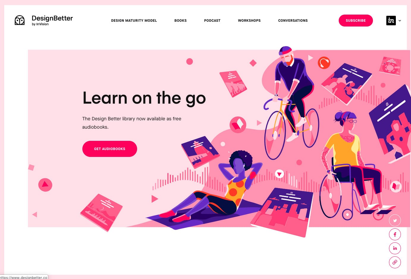
Their current website isn’t that bold blue they used in the email, but they likely have updated the website since the email was sent. The email structure, font and CTAs are all similar, so there is a level of consistency from email to web, so a thumbs up on that one. ?
Mobile view
As expected, the mobile view is very similar to the desktop view, as the layout is simple and focuses on a single column, no fancy stuff going on. Like others before, they have prioritised great design over complex coding.
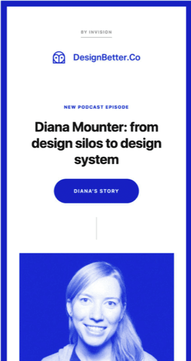
I also like the use of white space, they’ve not bunched all of the buttons and text up in a space-saving exercise, for example they’ve kept the space around the CTAs to focus the eye on the button, and only the button!


Layout
A super simple layout, but what’s nice to see if they’ve used text and HTML where they can, with the large photo taking center stage. The border colour is HTML, the central line down the center is a table border, not an image, and the buttons are of course HTML and text.
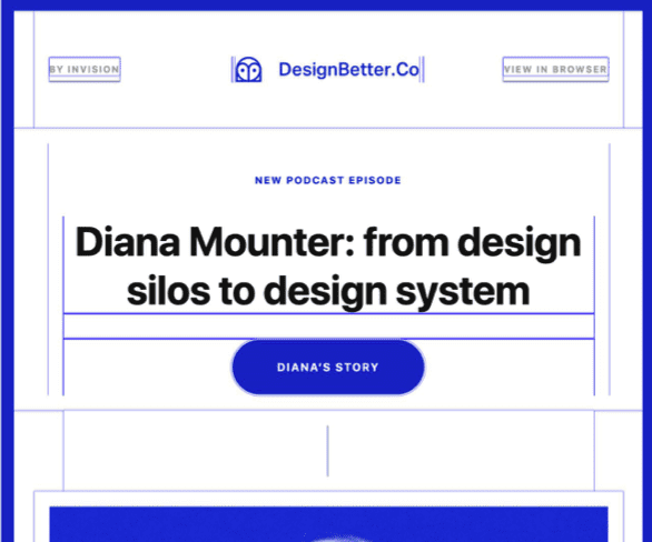
Images turned off
Due to the simplicity of the design and the structure, the design still works with images toggled. In fact, out of all of the designs featured, this fares the best.

Subject line

Hmmm, great design, but the subject line lacks some clout.
When you’re promoting a download, a PDF, a free guide, webinar or a podcast (in their case), try and mention it in the subject line, for example: From design silos to design system [Podcast].
Of course, if the podcaster or content author is well known, and you feel their name alone would be a hook, you may wish to mention them in the subject line, like follows: Diana Mounter speaks out! [Podcast], or something similar!
Ref: https://reallygoodemails.com/emails/design-systems-arent-new-but-theyre-not-a-cinch-to-build/
